Did you know that the average passerby has only three seconds to decide—keep the flier or toss it into the nearest bin? It is precisely these three seconds that determine whether your campaign becomes a success story or a silent murmur in a design folder. How can you turn a piece of paper into a small but powerful sales compass?
There’s a well-known saying in the marketing world: “A flier that doesn’t engage at once will never engage at all.” This mindset drives us to seek not only an attractive appearance but also precise content and strategy. That’s exactly the purpose of a structured creation of fliers, where each step reinforces the next.
Next, let’s look at five steps that will help you create material that not only grabs attention but also motivates action. We start with the basics—a clearly defined goal.
Even the most eye-catching design can seem bland without a specific goal. Ask yourself: what action do you want someone to take after reading the flier? Maybe it’s a visit to a pop-up store, registering for a webinar, or simply sampling a product. A precise aim determines the tone of the text, design highlights, and distribution locations.
If your goal is to collect event registrations, highlight the time limit and registration link. If you’re promoting a special offer, visually emphasize the discount and highlight the end date. The goal even influences the choice of paper—a glossy finish looks more luxurious, while a matte finish creates a premium feel.
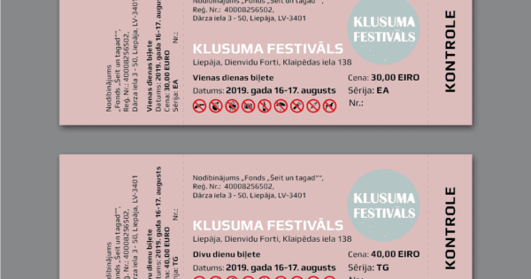
To move purposefully towards results, it’s worth considering professional solutions such as production of fliers by a full-service print shop, which saves time and ensures quality.
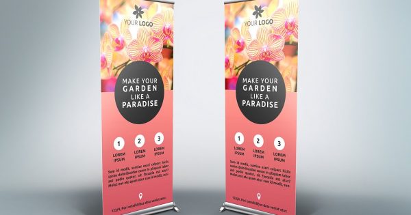
The eye first searches for color and shape, only then turning to words. That’s why color psychology is your secret ally: blue creates trust, yellow encourages action, red raises the pulse. Choose contrasts that work together rather than compete. If your flier is chaotic at first glance, the brain dismisses it as background noise. Two main colors and one accent suffice; leave the rest as white space, which breathes like silence between notes.
With a variety of fonts, the temptation is to use five, but it’s safer to stick to two: one for headings, the other for body text. “Less is more” isn’t a cliché when it comes to readability from two steps away. Images should be high-resolution and tell a story: it’s better to show action than a static product image. This way, the visuals become a guide, leading the viewer’s eye all the way to the call to action.
It is often forgotten that people read fliers in a zigzag pattern. The headline attracts, the subheading explains, the highlighted fact proves, and the call-to-action closes the deal. Instead of one clear headline, many choose three, causing confusion. Here, your best friend is striking contrast: 16 pt heading, 12 pt text, 10 pt supplementary info. Keywords must fit in naturally; otherwise, they look like advertising billboards.
For effective hierarchy, break text into blocks of 40–60 words. An overly long chunk silently tires and repels the reader. Lists, icons, and short quotes—“Sign up now, limited places available!”—act as shortcut keys for the reader’s brain. This structure ensures that creation of fliers is not an info dump, but a purposeful story that completes itself.
Even the most meticulously designed flier loses impact if it ends up in the wrong hands. Identify where your target audience spends time: conference foyers, street events, or café bulletin boards. Sometimes, 200 personalized fliers for your customers are more valuable than 2,000 anonymous ones in the city center. Added value comes from including samples or discounts—giving the paper a “second life.” Nuances like these increase the chances that your flier will be saved in someone’s bag rather than thrown away.
Do not overlook the synergy of the digital environment: a QR code leads directly to the campaign page, and an NFC sticker allows for instant phone access to information. Physical and digital begin to resonate as a duet, making the information journey shorter and more convenient.
What cannot be measured cannot be improved. Define metrics from the start: number of scanned QR codes, redeemed coupons, or event attendance. Several smaller measurement units, such as date and location, reveal where fliers work best. If results lag, change the accent color, move the “Call-to-Action” higher, or use a different paper texture. Small adjustments often return a greater yield than a complete overhaul.
In conclusion, it is clear that effective creation of fliers is not accidental art, but a structured method: a clear goal, captivating design, hierarchical information, proper distribution, and precise measurement. When all five steps work together like gears in a mechanism, the flier becomes a bridge between brand and customer. Are you ready to apply these principles and turn your next campaign into a visible success?