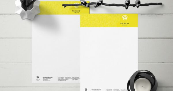
Did you know that on average, 40% of all advertising fliers end up in the trash before they are even read? Often, the problem is not the idea itself, but simple everyday printing mistakes. Imagine this scenario: a café is rushing to open a new terrace, flier printing happens at the last moment, and the finished batch reveals an incorrect business hour. The result—lost budget and missed visitor flow. How can you avoid this?
Let’s start with the most important stumbling blocks that most often lead to disappointment and additional costs.
The most frequently heard phrase in printing houses: “Why does the print look pixelated when everything seemed fine on the computer?” The main reason—images with low DPI are being used. Screens require only 72 dpi, whereas flier printing requires at least 300 dpi to prevent images from losing sharpness. Before submitting your files, check every visual element and make sure it meets print requirements. Otherwise, even a brilliant design will look amateurish.
RGB may glow vividly on the screen, but printing machines operate in CMYK mode. If the file is not converted, a colorful tropical sunset can turn into a grayish-brown evening on paper. To preserve the intended richness of tones, switch your document to CMYK right at the start of the design and conduct a preliminary color test. If necessary, consult professionals or use online tools that compare color differences.
Another valuable resource is the flier printing guide, where you can find detailed recommendations on format, paper, and finishing processes.
“Why is the printed edge uneven?”—printers hear this question as often as a barista is asked for an “oat milk latte” on a Monday morning. The reason lies in millimeters: if the file does not include a 2–3 mm additional area (bleed) on each side, the cutter may “take” away part of an important design element. This results in both a loss of visual symmetry and branding consistency. Before flier printing begins, check that background colors and full-background images extend beyond the trim line, while text and logos are within the safe zone at least 4 mm from the edge.
A handy trick: print your layout on ordinary office paper, cut it along the marked lines, and compare it to what you see on the screen. This kind of “paper proof” often reveals nuances you might miss on a monitor.
Elegant, thin typefaces may look modern, but they can “disappear” on glossy paper, especially if lighter colors are used. A reader who has to strain their eyes will quickly put the flier aside. To maintain legibility, choose a font with a line thickness of at least 0.3 mm and ensure a strong contrast between background and text. This simple correction can increase the readability of your information by up to 60%.
If you want to use light text on a dark background, consider adding a subtle stroke or shadow. Professionalism is found in details: a small highlight can make the difference between an elegant look and unreadable chaos.
Even a meticulously prepared design will lose its appeal if printed on inappropriate material. Glossy paper enhances bright colors but may produce glare in artificial lighting, while matte absorbs ink and decreases contrast. For example, a cosmetics brand once chose an extra-thick cardboard to emphasize a premium image, but forgot that the fliers had to be delivered by mail—shipping costs tripled. Would thinner, high-quality Creative Print paper with silky lamination have saved the day? Most likely, yes.
Before flier printing, determine the weight (gsm), texture, and coating of the material that best matches your brand message and distribution channel. If fliers are to be left on an outdoor café table, lamination protects against moisture. For mass distribution through mailboxes, thinner 130 gsm glossy paper is suitable, whereas for B2B conferences, thicker 250 gsm matte paper gives a more professional impression.
Decision-making is made easier with the touch test at the print shop: take some samples, check color rendering, and feel the firmness of the paper. This small investment up front can save your budget later, since fixing printing mistakes is always more expensive than preventive testing.
In summary: image resolution, CMYK color mode, bleeds, legible fonts, and the right paper—these are the five cornerstones upon which successful flier printing is built. Will you consider each of them in your next project so your advertisement confidently attracts attention and doesn’t end up in the bin?