Studies show that a person decides on a brand’s trustworthiness in approximately 27 milliseconds. That is how little time company blanks have to convince your partner of your professionalism. Can the form you send to a client sell as effectively as a sales specialist? Let’s explore how design can become your secret weapon rather than just a sheet of paper.
The first glance follows the natural reading flow — from the logo to the contact information. When arranging the elements, a simple rule must be followed: one main point of focus and no more than two secondary ones. If the logo competes with the headline, attention is scattered and trust is lost. Use sufficiently wide margins to let the text breathe; white space makes the brand appear more modern and premium.
Color psychology is not a myth — blue tones reduce stress levels, while red increases heart rate. Choose one main brand color and one contrasting accent; otherwise, the blank will resemble a carnival. The paper texture also plays a role: slightly matte coating makes pigment more saturated and reduces glare. A quick test: place your palm over the template; if the elements seem to “jump” out, the contrast is too strong.
If you need professional blank printing, the right printing house can accurately reproduce the selected Pantone shades, maintaining brand identity in every print run.
The font is like a vocal timbre — it conveys a message even without words. Serif styles project a conservative, academic image, while sans-serif brings dynamism and innovation. When choosing typefaces, combine just two families: one for headings, another for body text. Avoid fonts that are too narrow or decorative; blanks are often copied and scanned, and complex letters lose clarity. For even visual rhythm, ensure a minimum of 10 pt size, but for legal disclaimers, 8 pt is sufficient if contrast is high enough. Remember: letter spacing balances the space between words, making it easier for the eye to glide across the page.
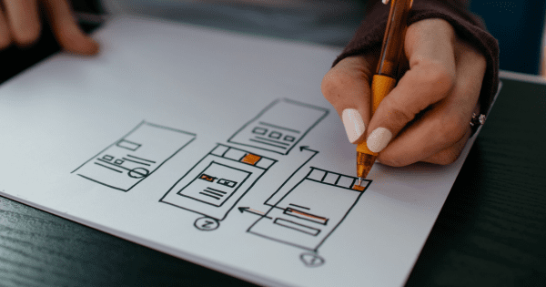
The quicker the recipient understands what to do next, the sooner a purchase will occur. Apply a clear sequence: “read – sign – send.” For this purpose, use
Each field should be labeled with a short, uncomplicated name. If a field is not mandatory, mark it with a lighter tone to reduce cognitive load. When testing the prototype, simulate: “The client opens the email, downloads the blank, and fills it in within 60 seconds.” If that is not possible, the information architecture must be revised.
By the way, a study on internet usability shows that the average office worker processes 121 emails per day. That’s why clearly structured company blanks are not only aesthetically pleasing but also save the recipient’s attention resources, allowing your message to be perceived at first glance.
Sometimes it is precisely the tactile sensation that determines whether a document ends up in a folder or the trash. When choosing paper for company blanks, consider a thickness of 90–120 g/m²: it is light enough for office printing yet sturdy enough not to let stamps show through. An interesting fact: by switching from standard to FSC-certified paper, the CO₂ footprint can be reduced by up to 30% while visually remaining just as snow white. For a touch of luxury, use embossing or selective varnish in the logo area; fingertips will instinctively touch the texture, and the product will keep the brand memorable longer than digital advertising.
Consider also perforation and micro-perforated scoring. A small “tear-off” coupon, like a payment confirmation, can potentially speed up the invoice cycle by 12%. This is an unexpected but measurable bonus that even large corporations often ignore.
From clear hierarchy to tactile surprises — every detail builds a story that convinces without superfluous words. When company blanks harmoniously combine typography, color psychology, and a well-considered flow of information, they become silent sellers that work 24/7. Will you let your paper stay silent or will you make it speak for your brand? Order your next print run with improved design and see how a professionally created blank can accelerate business processes and open up new opportunities for collaboration.